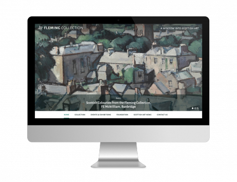
This August we launched the new website for the Fleming Collection. This exciting project put online the elegantly curated collection of The Fleming-Wyfold Art Foundation. The website also displays the creativity of the collection in its exhibitions, events and publishing strategy; and its desire and ability to showcase Scottish art and artists outside Scotland.
We thoroughly enjoyed working on this project, and it allowed us to showcase many Keepthinking talents at the same time; including a bespoke iteration of Qi, a rebrand and new logo, as well as the design and development of the website.
The rebrand responds to the change in the foundation’s strategy, moving from being known mainly as a physical space to illustrate their dynamic ‘museum without walls’ mission. In the same way, their brand moves from being primarily a printed one to the digital space. Our aim was to highlight the unique qualities of their collection and strategy: the collection is the best privately-owned collection of Scottish art, it contains high quality pieces, and they are approachable in bringing Scottish art to the world via their exhibitions and loans.
We wanted to give the brand a contemporary feel without losing their heritage, so we dived into the history of the Fleming family for inspiration.
Digital brands need a strong and simple symbol that can be used as an elegant shorthand in smaller applications (such as browser bars, social media feeds, etc). So in our design of the symbol based on a weave, we paid homage to the founder of the Fleming bank, Robert Fleming, who gained success as a jute manufacturer; whilst simultaneously providing the Fleming Collection with an elegant motif.
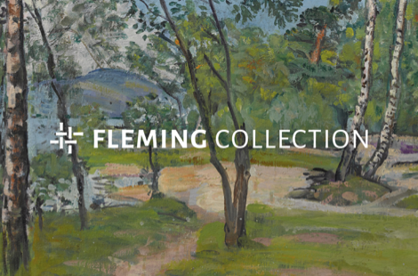
The distinctive ‘Fleming green’ was kept as the core colour, but it was refreshed and updated to match a second core colour (dark green) and two accent colours (grey and pink). These were all based on a painting by Samuel Peploe, which is part of the collection.
The symbol and colours are a perfect match with the logo, which uses a humanist sans serif typeface. This gives the Fleming Collection brand a unique feel and aids in making it stand out amongst their peer group of brands.
The website was designed to be image led, bringing the exemplary imagery of the collection to the fore. Combined with the new branding, this graceful site gives the Fleming Collection the digital presence it deserves.