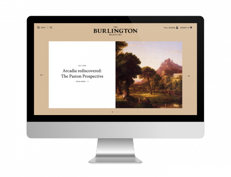
In March 2019 we relaunched the Burlington Magazine website. The print magazine was rebranded in 2018, and we were commissioned to redesign the site to coincide with this.
We worked with the new print-focused branding, transforming it with website UI design whilst simultaneously linking with their heritage of over 100 years and exploring a new digital experience. One of the ways devised by our team was to include a colour changing feature on the homepage, which mirrors the changing colour and images of the magazine’s print front cover. We also incorporated the new house fonts (Portrait and Founders Grotesk), giving the website a strong personality.
We also added some exciting new features. Users are now able to navigate through a newly expanded ‘What’s on’ section, where a calendar of events from all over the world can be browsed; the ‘jobs and opportunities’ section has been refined; there is a curated collated free content section; and there has been a comprehensive revisiting of the login functionality. Alongside this is all the usual high quality content you would expect from the Burlington Magazine, with an elegant new design that shows this content off at its best.
Visit the website, or see our own project summary. Also, do not forget to visit the Burlington Contemporary journal, online and on our project summary!

